
Do Markets Do Better In An Election Year? What The Data Says 1871 - 2023

Who wins in an election year? The bear or the bull?
The Claim
I’ve been hearing a lot of people say this will be a good year in the markets because it’s an “Election Year” the logic is usually along the lines of.
Politicians want to buy votes by increasing spending
The numbers are rigged to make the party in power look better
<Insert random conspiracy theory>
And it’s not just the crazy uncle who’s saying this over the dinner table, it’s “economist” in the news, bankers, well respected authors, and all the market gurus on the social media platforms.
Is there a decreeable trend within the election cycle? if so is it a strong and statistically relevant correlation or just noise? In this article we’ll put all of these claims to the test.
The Data
To answer these questions, I took the S&P500 index dating all the way back to 1871 and compared the different yearly performance based on what part of the election cycle we were in.
I got this data from ShillerData.com which is the same data set used in the famous and commonly used Shiller Index. It’s a well know data set that’s geneally accepted as being reliable. I will be excluding dividend returns from my calculations and only evaluating market returns as dividend yields don’t tend to change much year to year.
A couple quick notes before we proceed.
It’s important to understand that we are looking at a very long time period here covering many important events in history.
S&P Index
First lets talk about the S&P500 index itself.
The S&P500 didn’t have 500 companies included in the index until 1957.
The original S&P index was created in 1923 when the Standard and Poor’s introduced an index covering 233 companies.
The Robert Shiller team creates data going back to 1871 using several historical data sets and approximation techniques. While it’s not perfect, it’s a generally accepted standard today as a good enough synthetic approximation. More info about how this was done can be found HERE
History itself
Not only is it hard to get accurate data going back this far we have to acknowledge the role of history itself. It’s nice to think that elections in our country are the most important thing in the world but there are other world events that have had a broader impact on the US economy
Since 1871 the US has been involved in the following wars
1861-1865 Civil War (Why we don’t look at data before 1871)
Spanish American War 1898-1902
World War I (1917-1918)
World War II (1941-1945)
I think this is a good place to remind everyone that past performance does not guarantee future returns. We are always just one major war away from chaos.
Another interesting note is many states had their own currencies and sometimes banks themselves did as well prior to the American Civil War. It wasn’t until the enactment of the National Banking Act of 1863 during the American Civil War the eventually taxed states bonds and currencies out of existence.
After that the United States Federal Government Dollar became the sole currency of the United States that we still use today. This important to recognize events like this when evaluating trends over long periods of time because assumptions that are true today are often not held across history.
It wasn’t until after World War II that the Untied states was truly considered a true economic super power and the period from 1950 to present day (74 years) is generally accepted the period that the US has been a modern economy on a world stage.
For these reason we’ll be looking at this data over 2 time periods.
Recorded Era 1871-2023 (152 Years / 38 Election cycles)
Modern Era 1950-2023 (73 years / 18 Election cycles)
Recorded Era (1871-2023
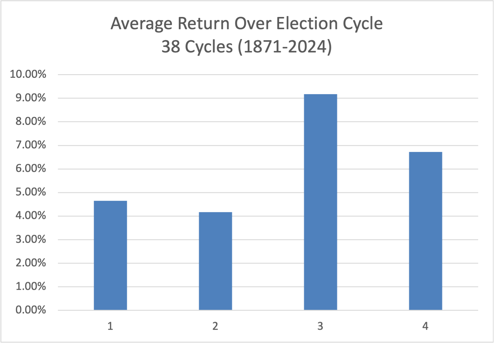
Election Cycle Returns 1871-2023
As you can see from our pretty chart above representing 38 election cycles there does appear to be a pattern. The 1st and second years after an election are relatively flat with 4.65% and 4.17% returns respectively. Note Dividends are excluded from all data in this article)
I found this a little surprising as markets tend to like clarity, and after an election normally the agenda of the incoming administration is broadcast loudly and clearly, far and wide.
This is then followed by a very strong 3rd year of 9.17% then bookended by the 4th year of a presidency with a more modest 6.73%. Note all years have a positive average return which makes sense as the US markets have generally growns with the US rise to power.
In case you were wondering what presidents were in office during the best and worst stock market years.
Best Year: 1933 S&P +48.66% (Election cycle Year 1)
President Franklin Delano Roosevelt (FDR)
Worst Year: 1931 S&P500 -48.06 (Election cycle year 3)
President Herbert Hoover
Interestingly both the best and worst years of the market are around the events of the great depression. Furthermore the best year was in election cycle year 1 which is a statistically a relatively weak year. And the worst year was in election cycle year 3 which is normally a bit stronger. What gives? Maybe this isn’t as good of a predictors as we thought?
Lets take a closer look

Election Cycle Returns 1871-2023 Table
As we can see from this table, standard deviations are quite wide on these averages ranging from about 2X the average (Year 3) and 4.5X the average (Year 1) hardly a reliable predictor. In fact a monkey throwing darts at a board might do better.
Lets plot this on a scatter chart with a line of best fit so we can more clearly see the trend and how correlated the data is to the moving average thru an election cycle
The Full Story Recorded Era 1871-2023

Election Cycle Returns 1871-2023 Scatter Plot
I think this chart sums up this data quite nicely. We can see every year of the election cycle has an even yet very random distribution around it’s statistical average. That being said, just because a data sets periodic average has a drift doesn’t mean it’s correlated to the event being tested, in this case market performance vs election cycle year.
In fact if we look at the R-Squared value (Remember 1 is a perfect fit while a 0 is perfectly random) this line of best fit has an R-Squared value of 0.0126 which means there is essentially zero meaningful correlation between the election cycle year and market returns.
With a data set of this size we’d need to see an R-Squared value of 0.3-0.4 to even start thinking their was a weak correlation, and an R-Squared value of 0.75+ to say they are strongly correlated (Remember there are only 38 election cycles represented here, making this a limited data set.
Modern Era 1950-2023
This is all find and dandy you say! But what about the Modern Era? Those old timers didn’t have the level of sophistication governments and policy makers have today! Data collection is a bit better, we’ve been relatively free of major wars, and the United States has become a major global super power.
Also with broadcast TV and more sophisticated government systems could bad actors be manipulating markets to try and win votes? Maybe this period will show a stronger trend. Let’s take a closer look.
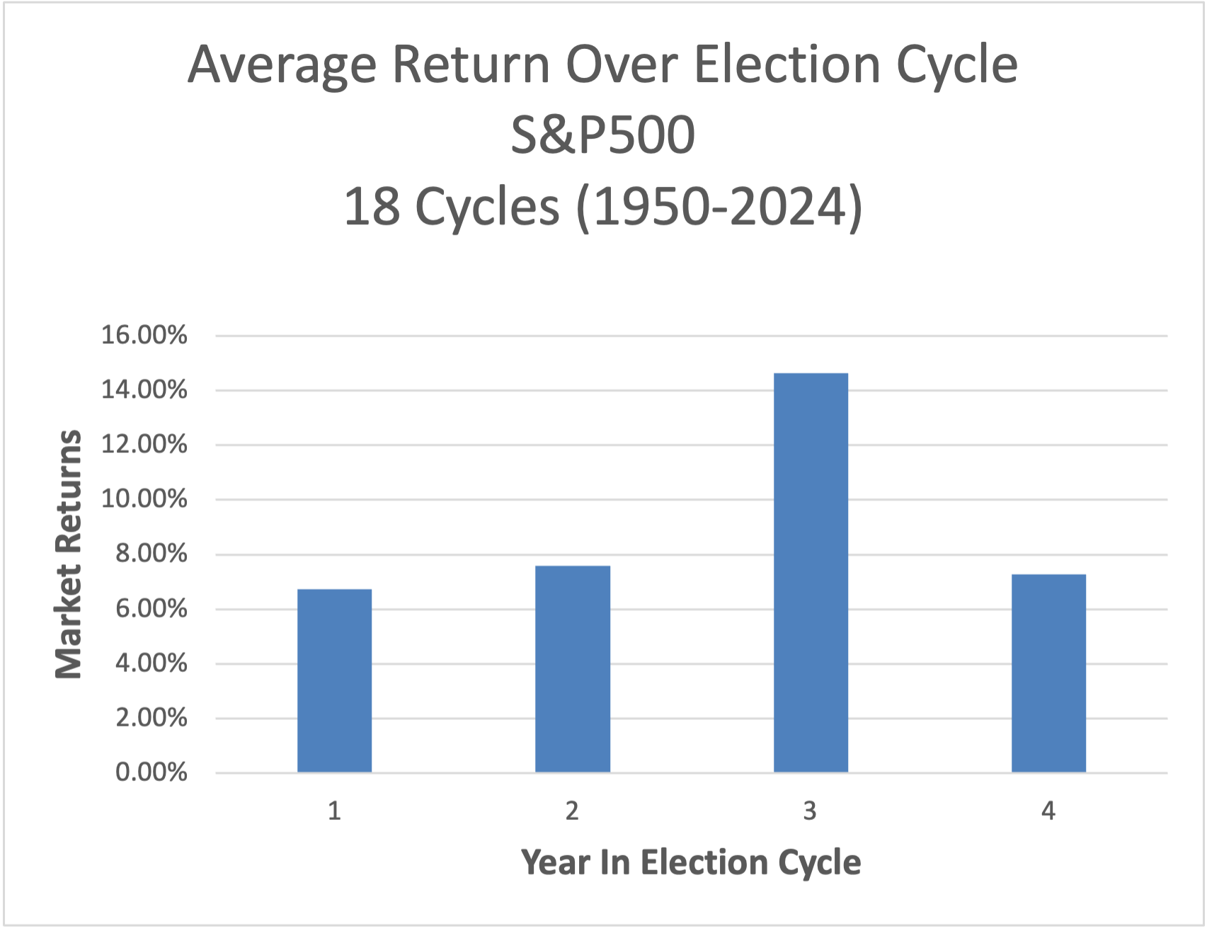
Election Cycle Returns 1950-2023

Election Cycle Returns 1950-2023 Table
In the above graph and accompanying table we can see a similar pattern but the Modern Era data seems to show a stronger positive trend across all phases of the cycle. With years 1, 2, & 4 close to 7% (6.73- 7.59% and year 3 about double that.
It’s interesting that year 3 is about double the other 3 years, the strongest trend we’ve seen yet!! But it’s still not the magic people speak about in regards of an election years. Let’s take a closer look at the data with our scatter plot and best fit trend line as before.
The Full Story Modern Era 1950-2023
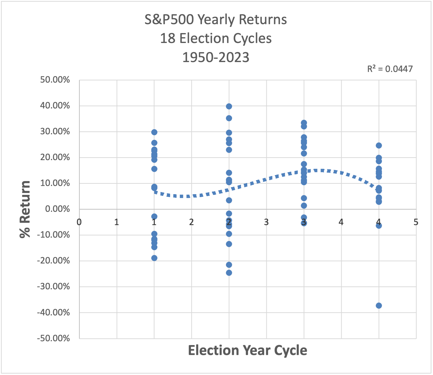
Election Cycle Returns 1950-2023 Scatter Plot
As you can see from the scatter plot it looks very similar to the earlier Recorded Era Scatter we reviewed earlier.
Here’s what jumps out at me. While year 3 does appear to average a bit higher, it’s mainly because it doesn’t have any truly bad years in the data set unlike year 1 & 2 which both have a couple bad years with nasty losses (aprox -20% or more (3 events total in years 1 & 2) )
Year 4 seems to be the most tightly clustered set with very few truly exceptional or terrible years, the issue with testing small data sets such as this (only 18 election cycles total) one or 2 random events can really push the averages around giving you a misguided sense of a possible pattern.
Based on both my review of both time periods Recorded Era 1871-2023 and Modern Era 1950-2023 I have to conclude that an election year does not lead to better market returns overall. If there is any pattern in this data there may be a weak correlation with the 3rd year in an election cycle and a modestly more positive market trend in the Modern Era 1950-2023. That being said the correlation is very weak and not something I would change my investing strategy around, as you can see from the chart year 3 has had rough years too. While there maybe be a weak trend, It could just as easily be randomness we are seeing in a limited data set.
Other data people seem to agree with my analysis. This article for example from Fidelity seems to confirm some of our findings The 2024 Might Not Affect Markets As Much As You Think.
A Note On Average Market Returns
>>While reviewing this data shows that only 36.8% of the 152 years since 1871 returning a negative yield (Not including dividends). And 2024 is off to a hot start just reinforcing this positive trend.
Since the United states has entered the Modern Era (1950-2023) the markets have averaged solid return of 9.12% with only. 27.0% of the years returning a negative return. I certainly wouldn’t want to bet ageinst the American economy regardless of what phase of the election cycle we are in. You’re best bet is probably to stay investing and Dollar Cost Average (DCA) into the market when you get paid, so you can capture as much of that 9.12% return as you possible can over a long time period.
Conclusion
I did this little exercise to verify if what we accept as “Common Knowledge” that markets tend to perform well in election years was true or not. Turns out in this case there is essentially ZERO meaningful correlation between any part of the election cycle and market returns.
While we initially saw the average market returns do very from year to year within a cycle it can be attributed mostly to noise in the random data. This was verified both by comparing the best and worst S&P500 years (1933 & 1931 respectively) and seeing they did not land on ether expected election year predicted by our historical averages plot.
Then confirmed by our more comprehensive evaluation which demonstrated the R-Squared value of a best fit trend line was poorly correlated (0.0126 Recorded Era & 0.0447 Modern Era)
Any time you see a data set where the standard deviations are 2-5X the average value and 4-10X the variance between periods you need to take a closer look, it’s usually a sign that the data is very random with no true correlation. I will say the overall upward trend of US markets was strong and consistent since 1871 and shows no signs of slowing down.
If you enjoy posts like this where I take generally held investing beliefs and see if the data supports the claim you should subscribe to the News Letter! We’ll be doing more breakdowns just like this one!
And just a reminder past performance do not guarantee future returns.
If you’re interested in some investing strategies for uncertain times you might check out our article on The 3 Fund Strategy. It’s a simple approach that tries to minimize various risks while still giving you exposure to potential market upsides.